OptiNod Academy
There Is No Magic Strategy — Why Changing Only the Time Frame Produces Losses (2/3)
Leave the same symbol in place and lower the one-hour chart to the five-minute chart, and why do losses appear? The second part of a three-part series, explaining fees, false sharp drops, and the different result of the same signal.
The same symbol, the same analysis — yet lower the time frame to the five-minute chart and losses appear. On a faster chart the fees stay the same while the gain captured in one trade shrinks, and the same movement leads to a different next result.
The previous part explained why a formula that makes money anywhere does not last. The key point was that the more widely a setting applies, the faster its opportunity disappears, and the longer a setting makes money, the narrower its range of application. This part deals with one part of that range: the time frame. Leave the symbol in place and merely lower the one-hour chart to a five-minute or one-minute chart, and the same setting turns into losses — and the reasons for this are not just one.
First, why people lower the time frame. A faster chart produces signals often, and once a trade is right, the result comes quickly. You can trade more often in the same span of time, so it seems you would make more. But a faster chart comes with costs and traps that a slower chart does not have.
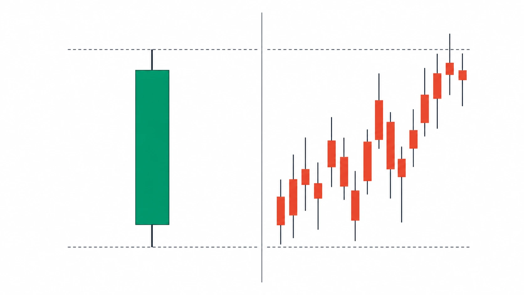
On a fast chart, fees take up a large share of the profit
A cost is attached to each trade: the fee paid when buying and selling, and the difference that arises when the order is not filled exactly at the price you wanted. This cost is attached at the same size to each trade and does not shrink when you change the time frame.
Suppose the round-trip fee is 0.1 percent. Aim for a 3 percent move in one trade on the one-hour chart, and the fee is one-thirtieth of that move. It is barely felt. Lower the same setting to the five-minute chart, and the gain aimed for in one trade shrinks to 0.5 percent. The fee stays at 0.1 percent, so now you pay one-fifth of the aimed gain in fees. On top of that, the number of trades multiplies several times over, so the number of times you pay the fee rises along with it.
One thing becomes clear here. The faster you lower the chart, the smaller the gain captured in one trade, while the cost does not shrink; so below a certain speed, even choosing the direction correctly produces losses from cost alone. Every setting has a limiting speed past which cost exceeds profit.
Sharp drops on the five-minute chart are often false, and buying along with them produces the opposite loss
A fast chart has many false movements. On the five-minute chart, a sudden large drop in price appears often, and this drop frequently rises back within an hour. It is because large funds sold briefly, or because someone deliberately hit a price where stop-loss orders were clustered, dumped them all at once, and then bought back.
A drop of the same size on the daily chart that falls all day long is often a signal that the flow has changed, so it continues the next day too. The shape is a "sharply falling candle" in both cases, but the next result is the opposite. One rises back, the other falls further.
So the same rule of "see a sharp drop and sell along with it" makes money on the daily chart by following the direction, and on the five-minute chart produces losses against the price that rises back. The same shape is not the same signal. What comes after that signal differs by time frame, and the lower you go toward a fast chart, the more often these opposite cases appear.
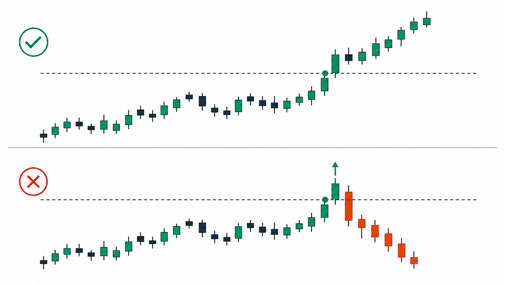
The same breakout lasts for days on the daily chart but soon turns back down on the one-minute chart
Take a breakout as an example: the movement where price rises above a line it had been blocked at for a while. Cross this line on a closing basis on the daily chart, and price often runs above it for several more days. A breakout on a larger time frame was built from that many accumulated trades, so once the direction is set, it does not change easily.
A breakout of the same shape on the one-minute chart is different. It commonly crosses above briefly and then comes back down within a few minutes. The line on the one-minute chart was built from a small amount of trading over a few minutes, so it drops back the moment buying eases even a little. The same rule of "see a breakout and buy" makes money on the daily chart by following the direction, and on the one-minute chart produces losses against the price that comes back down.
This difference has the same cause as the earlier story about sharp drops. On a larger time frame, a movement has a strong tendency to continue into the next, and on a smaller time frame, the same movement has a strong tendency to return to its starting place. So trend-following trading and counter-trend trading reverse, even on the same symbol, as to which one fits depending on the time frame.
As the number of trades rises, small losses and small costs accumulate
A fast chart produces signals often, so it also trades often. A setting that traded once or twice a day on the one-hour chart trades more than ten times a day on the five-minute chart. More trades looks good, but each added trade carries the cost seen earlier, and the chance of being wrong rises along with it.
Moreover, the faster the chart, the larger the share taken up by brief fluctuations rather than the real flow. Within a single one-hour candle, small fluctuations are averaged out and hardly show. But on the five-minute chart, each of those fluctuations looks like a signal. So on a fast chart, brief fluctuations are often mistaken for signals and traded on.
Each small loss is not large. But as the count grows, the sum becomes large. When a setting that fit well on the one-hour chart turns into losses on the five-minute chart, the many small losses and costs weigh more heavily than any single large mistake.
Things tied to time cannot be moved by candle count
Trading has events that occur at fixed clock times regardless of the number of candles. The funding cost of perpetual futures is usually settled every eight hours; the times when the major markets open and close are set; and the close of the day and of the week comes at a set time. These events are set by the clock, not by the number of candles on the chart.
A one-hour setting often follows this rhythm of clock times without anyone realizing it. If, for example, eight one-hour candles exactly match one funding cycle, that setting naturally reflects the movement around funding. But lower the same setting to the five-minute chart, and the candle-count basis no longer matches these clock times. The default period values of indicators are also often set with reference to a particular time frame, so changing the time frame breaks that reference too.
So when changing the time frame, looking only at the number of candles is not enough. You have to check together which rhythm of clock times the setting was leaning on, so that you can tell what no longer fits after the move.
- Cost ratio: At the time frame you are moving to, calculate how many times the round-trip fee the gain aimed for in one trade is. Below ten times, suspect the risk that cost will exceed profit.
- The signal's next result: Check again, at the time frame you are moving to, whether this signal follows the direction or runs against it. It may be the opposite of the larger chart.
- Number of trades: After lowering the time frame, see how many times over the daily trade count rises, and check whether the profit can bear the added cost.
Even for the same symbol, changing the time frame is not the same as simply zooming the same chart in or out. A fast chart carries costs a slow chart does not, the same shape leads to a different next result, and it does not match the rhythm of fixed clock times. So when changing the time frame, do not carry the setting down unchanged; first check whether the gain, cost, and rhythm the setting leaned on still fit at the new time frame. The next part explains what changes when you change the symbol, and what to do at that point.